Sunday, March 31, 2013

Week 9 Out of Class

This week we had to continue with our card sorting by completing 3 open remote card sorts, 3 closed card sorts, and 3 closed remote sorts.

OPEN


For my open remote card sort I received a lot of the same answers that I did in class. Most people still organized all the candy into one group, calling it food, candy types, or sweets. I completed this sort with some of my family members who had no explanation before completing the sort as to what the site was about. I feel that this is why I received some many various answers. One even titled a category "miscellaneous" and only put 2 items in there. Overall the open sort didn't help me a lot because it really just told me what I already have. Based on the data I received and the personas of those completing the card sorts, I am understanding that the participants weren't thinking in a website navigational way and were just putting things into categories. This sort was still helpful to help me narrow down my category list for the closed sort. 


CLOSED


 The categories I used for the closed sort were news, info, home, shopping, and specials. I did it this way to try and see if people would split up the candy into more then just one category. Most people still created their own candy category, but some created separate categories. A lot of people put the cakes, sugar free, and southwest flavors into the specials category as well which I never thought of, but I would make sense for it not to be part of the types of candy. One of my sorters also created a separate chocolate and fudge category which was something different but could possibly work to separate the candy a little bit. It was interesting to see what the sorters put on the home page, It had everything from videos, calendars, magazine articles, contact information, and house specials. 

Wednesday, March 27, 2013

Week 9.2

Today in class we did our open card sorting. From my observations most of my worries actually came true. Most people put all the candy types into one big category and didn't split them up how I wanted. I'm not sure if this is a good thing or not. I'm assuming that this is how they want it to be organized so we will see how the remote sorts go as well. My first sorter basically set the site up the with the same navigation that I already has. This was good to see that maybe the site wasn't as disorganized as I thought and the real problem lies with the number of links on the home page.


My second sorter had a similar technique, she just put things into more categories. Mostly everyone put the calendar of events with the holidays and separated that from the holiday chocolate. This is something that I wasn't expecting, but makes sense as to why they would do so. She also decided to put the Breaking Bad experience into publicity which I also think is a good idea. This was originally on the home page and all of my people sorting didn't see the connection which I had trouble seeing as well with the site. With putting it into publicity this would eliminate the problem of confusion when you go to a candy site. 


My third sorter we had durring class did mostly similar things to the first two. She did not separate the breaking bad experience and kept them in their own category, but she did include the calendar of events into the holidays. One thing that she did do was separate "southwestern and mexican flavors" and "sugar free chocolate" when I asked what category she gave this group she said it was specialty items. This is something that I thought I could include in my closed card sort and see what sort of results I get.  


Monday, March 25, 2013

Week 9.1

Today in class we first wen over our audits that we finished over break and the 4 questions we had to answer. After discussing our answers and showing the site we took the time to make changes to what we had answered previously.We also went over card sorting and started creating our cards for next class. We learned that there are different types of card sorting both open and closed. Open is when participants group cards with no pre-established groups into sections that they believe work together. Then closed card sorting is when you take information based on the open sorting to start off with groups to sort the cards into. These would be based on the observations made during the open sorting of where most participants sort cards into groups they believe work the best.  I think this exercise will help a lot for my website because there are so many main navigation links that need to be sorted into smaller categories and organized in a way that is easier to follow.

Wednesday, March 20, 2013

Week 8 SPRING BREAK

This week was spring break and our only assignment was to finish the audit we started in class last thursday. I took a lot of time to get everything down on my audit from the Candy Lady site. Going through it I found myself getting very frustrated because so many links were repeating and the navigation was just so long and confusing. I finally finished and here is the last few lines on my audit. 


I found my key to be very important because I did have so  many repeating links and cross links that it would be very confusing if I didn't use a color system of some kind. 

I also had a few questions that I needed to answer about my site based from the audit I created. 

1. What content do you have?
The home page is simply just an introduction to The Candy Lady and how she got started. From there it goes in many different directions all linking to different (and sometimes the same) pages for types of candy. The other content that is on the site deals with publicity. She has facebook links and links to videos as well as articles about the shop.

2. How is the content organized?
Mostly the content is organized by type of candy. The biggest problem with the site is the repeating candy in different links. There are also many links that take you to the same page. This makes the links spread out in so many different sections making the main nav very large and hard to follow.

3. Who creates the content?
I am assuming that the content is created by the owner. All of the information is about the candy, the price and also the quantity of the product. Also in the publicity section they seem to be outside articles written about the Candy lady company and news videos doing the same type of stories. There is also a facebook link that content is sometimes created by the user in the form of comments. With the candy there are some pieces that I believe are not created in-house and then the information about that type of candy could possibly be out-sourced. The shopping cart is something else that I noticed is not created in-house. It was supplied by Mal's Ecommerce site.

4. Where does the content live within the technical infrastructure?
The majority of the site like I stated before is mostly the candy so they are all within sections of different types of candy. There are only a few external links that would take you to the facebook page, or to youtube. The shopping cart also is an external link powered by the Ecommerce site. 

Overall the site isn't too hard to find what you are looking for because it has such a vast main navigation. For some people though this could get confusing because of the repeating items in different links. The problem now becomes, if you found something once, how do you find it again? 


Wednesday, March 13, 2013

Week 7.2

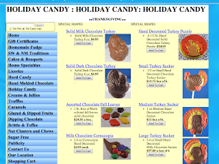
Today in class we had time to start on our audits of the site we chose I decided to go with the Candy lady site. It really is a horribly designed site with no sense of organization at all which became even more evident once I started my audit. As you can see in the visuals below, there are a lot of links just in the home page. It took me all class just to get through the links that are just on the home page. Many of which repeat and go to the same page. I also came across another problem, since the site is for a candy shop, there are a lot of different products and all lead the the same place (a shopping cart) most pages get very repetitive like the thanksgiving page seen below.


Monday, March 11, 2013

Week 7.1

Today in class we went over the websites we found last class and I realized that mine were not as disorganized as badly as I thought. I took time today to find sites that truly are disorganized and need help with the user experience. Here are just a few sites that I am thinking about using. They have a lot of links and not a very clear navigational system.

http://thecandylady.com/index.php


Sunday, March 10, 2013

Outside Class Week 6

This weekend out of class assignment was to read the Smashing Magazine article What is User Experience Design? I found this article very interesting. A lot of the information was a review from other articles or books we have read in class. However, the most interesting thing I found was in the criticisms of UX as a profession. Something I never thought about was that people believe that UX designers are too far removed from the process. This is so by UX designers that have no background in the process of building webpages and can't devise solutions. I feel that this could be a very large debate amongst the web community and I wondering just how much of a difference this makes in web design. I found also the many website suggestions at the end of the article very helpful and possibly useful one day. Some of those are as followed...

http://www.uxbooth.com/

http://ux.stackexchange.com/

http://uxmag.com/

Wednesday, March 6, 2013

Week 6.2

Today in class we got our next project. We are going to create a document that includes all the research to redesign a site. This consists of studies, research, card sorting, audits or current sites, personas, etc. The end product will be a 11x8.5 document that is well designed including images and type that describes our findings. Our task in class today was to find poorly designed webpages that have too many links and are hard to navigate/ find what you are looking for. Below are screen shots of some of the sites i found, along with the links to the site.


Monday, March 4, 2013

Week 6.1

Today in class we had a final critique on our projects. We mostly talked about our progress and outcome of the flowchart and overall of the process. We started with brainstorming ideas and creating a lot of lists for various things. This is when we decided that football is such a complicated sport and we need to eliminate to only the most important aspects of the game. Next we split up the group each focusing on a different flow chart for a player, the coin toss, or the overall game itself. As a group then we found the best way to explain the sport after much brainstorming. We finally came up with using swim lanes in a stair step pattern to show the downs of a game. Since football is so repetitive it was important that we showed that each down there is the same outcomes and everything eventual ends in a score or a turnover.

Most people thought the flow was done very well and for a complicated sport, we did a nice job explaining the most important things. One comment was about connecting our penalties with visuals of some sort, and alos the player flowcharts stand out. However, this is something that we wanted to do since it is such a player driven sport each with their own responsibilities. The big comment was also on the color scheme. In our defense the colors did print differently on the final piece then on the test print, but I do agree that on the final print they do not scream football. Our main goal in using the colors we did was to stay away from the cliche green field, yellow field posts kind of thing. Like stated in the critique, it really depends on the user and what they perceive from the colors.

Saturday, March 2, 2013

Outside of class Week 5

Today Alhannah, Alyssa and I came into the lab to mount our final print out. Yesterday the two of them worked on making any final changes to the design, and got it printed this morning.