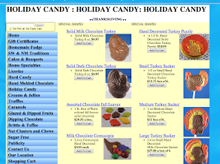
Today in class we had time to start on our audits of the site we chose I decided to go with the Candy lady site. It really is a horribly designed site with no sense of organization at all which became even more evident once I started my audit. As you can see in the visuals below, there are a lot of links just in the home page. It took me all class just to get through the links that are just on the home page. Many of which repeat and go to the same page. I also came across another problem, since the site is for a candy shop, there are a lot of different products and all lead the the same place (a shopping cart) most pages get very repetitive like the thanksgiving page seen below.


No comments:
Post a Comment